Designing New Business Cards

The youngest member of the Hot Butter team giving his critique of the new business cards. I think its safe to say that we really do make delicious infographics.
For too long we have been running a business without business cards. Well, that's not entirely true. We have been using business cards from our photography business. I was kidding myself that this was ok. My excuse was: We are a creative studio that operates in a mostly digital space and most of our clients are based overseas and discover us online anyway. But over the last few months I have had to own up to the fact that this wasn't good enough.
Recently we have being trying to market Hot Butter Studio locally and connect with Australian based business. This has been going great and we have been having a lot of face to face meetings which means we really needed business cards.
The pressure to design something that was creative and at the same time not too trendy was doing my head in. I wanted to create something classical and timeless but with character.
In the brain storming phase I tried out all different sketches but I just wasn't feeling it. Going against good design practice I decided to muck around in Illustrator even though I didn't have any solid ideas. I spent way too much time playing around and clicking my mouse hoping that creativity would spark.
I was getting frustrated and annoyed. Whenever I am stumped I always think of the scene from HBO's How to Make it in America where Ben and Cam agree to design (pro bono) graduation shirts for Nancy's son's middle school and the head of the design committee says with the most unimpressed tone that "if they weren't inspired, they shouldn't have taken the job". Sometimes I keep working and struggling when I am not feeling inspired just to say I have completed a task even when I know I am doing sub par work.
In this instance I knew that we had an upcoming trip to Sydney planned and I was under pressure to finalize the design and get the art work to the printer so that we would have cards to take to our meetings.
I eventually forced myself to step away from the project. I even convinced myself that we didn't need cards that our presentation would be creative and cool and that cards didn't matter.
As soon as the sense of urgency had dissipated, an idea came to me.
Once I had my idea the execution didn't take too long. I worked solidly for 4 hours to get it just right and to make sure that the design could be used in a template fashion for new staff as we grow. The idea was for each card to be a mini infographic illustrating each person's job title and skills. We decided to use fun job titles to better reflect Hot Butter's personality. For e.g. my title is "Work Horse" because I end up doing a lot of the time consuming administrative related tasks.
I knew I wanted a really simple colour palette; yellow and black which are our corporate colours. I toyed with the idea of using a neon yellow but I just didn't have time to get the cards printed offset. I also did not want to spend $2000+ on a design that I wasn't sure had staying power.
Now that the rush of our Sydney trip is over, I am going to swap the current CMYK yellow for a neon PMS yellow and get them printed with Taylor'd Press - who, btw do awesome stuff.
And here are the cards. As soon as we have a little more time we will take some professional shots. These quick snaps were taken on my iphone.


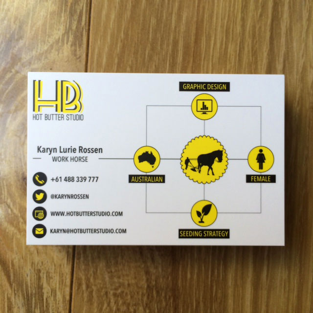
Karyn is the Work Horse at Hot Butter Studio